Coffee drinkers often struggle with these 4 main issues when purchasing their coffee:
1.Choosing the right blend among a multitude of options
2.Understanding their own taste preferences
3.Finding consistency across purchases
4.Feeling confident in specialty coffee decisions
Most coffee apps focus on transactions, not personalisation, and when they occasionally do, it feels like an after-thought and is often buried within the site. The goal with the 'Meister Kaffee' flow was to design an intuitive mobile experience that guides users to discover their taste profile by recommending tailored coffee blends. This method simplifies decision-making and reinforces a premium, craft-coffee brand identity. Gaining repeat customers was also a goal through the introduction of a seamless subscription model.
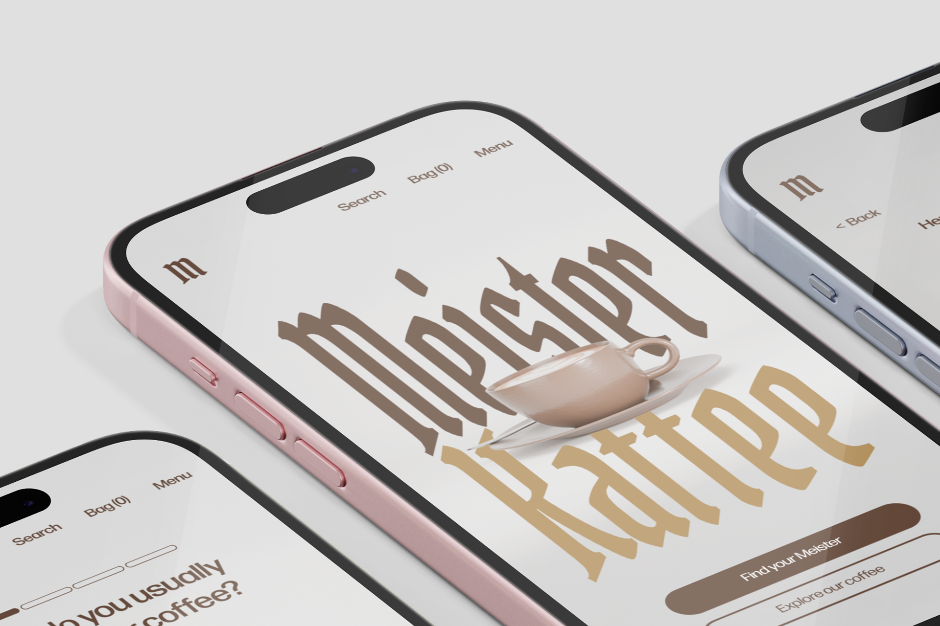
The solution to these issues was a personalised recommendation system that asks users guided questions about tastes and habits in order to build a “coffee profile”. This then matches users with curated blends and provides a clean, seamless and modern purchasing flow.
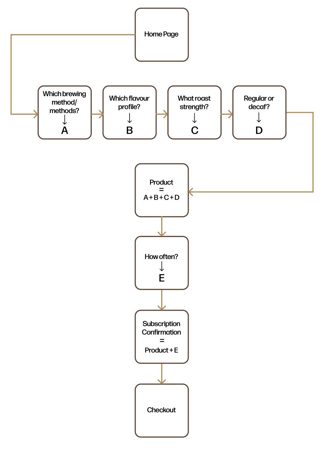
Flow Concept
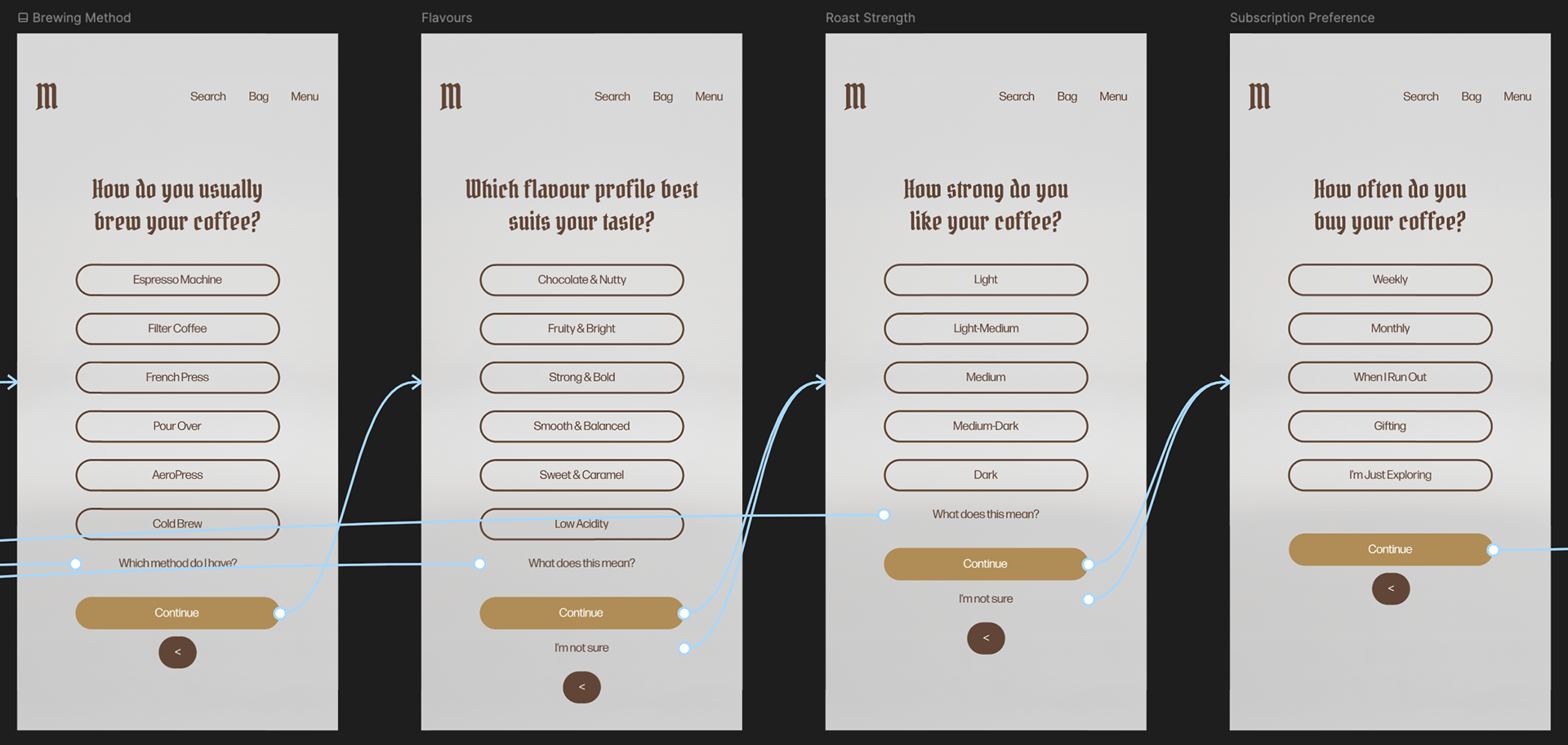
Initial Flow Design
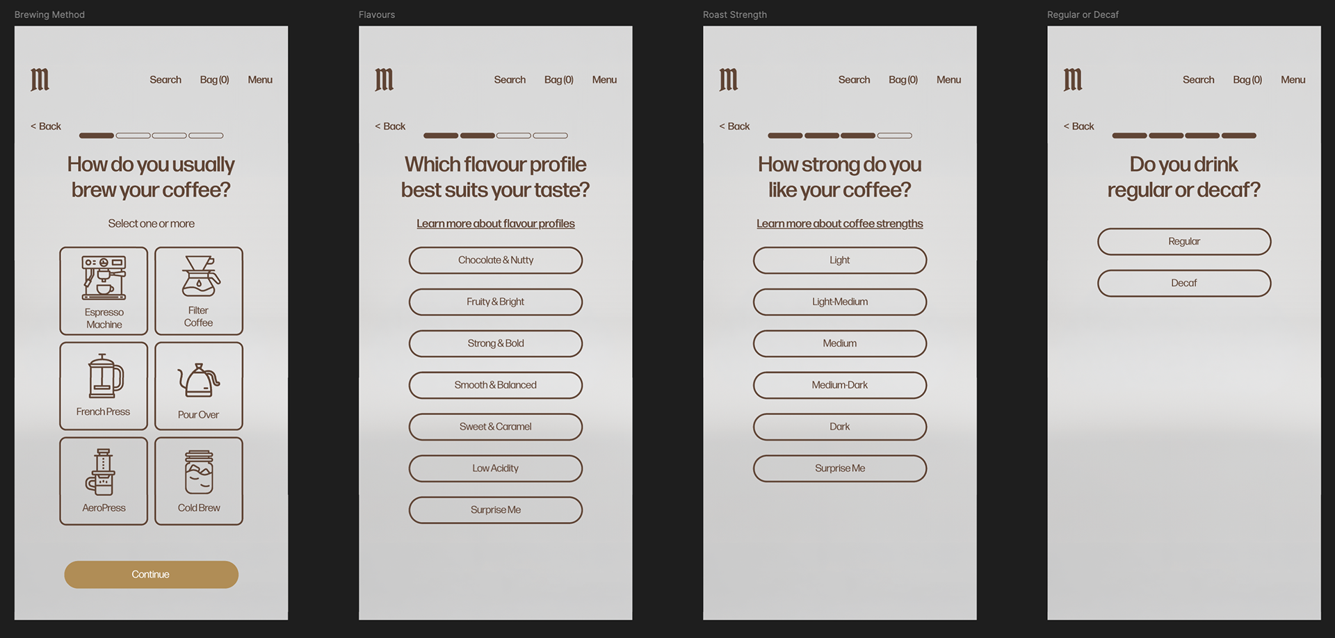
Final 'Find Your Meister' Discovery Flow
The initial flow created friction through several design choices. To streamline the experience, unnecessary ‘continue’ buttons were removed and screens now advance automatically after selection, which creates a more intuitive interaction pattern for mobile users.
A progress bar was also added to show users how many steps remain, helping to reduce abandonment by setting clear expectations around completion time. The UI was further changed to improve readability, replacing hard-to-read typography with a more accessible and legible style.
A progress bar was also added to show users how many steps remain, helping to reduce abandonment by setting clear expectations around completion time. The UI was further changed to improve readability, replacing hard-to-read typography with a more accessible and legible style.
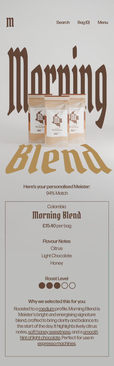
Initial Product Page

Developed Product Page
Final Product Page
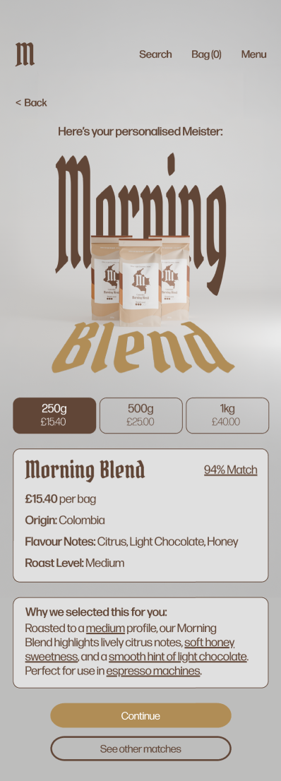
The final design refined the hierarchy of the page by scaling down the decorative elements, simplifying the roast level into plain language, improving spacing and readability and shortening the recommendation explanation into a more digestible format.
Navigation and CTA language were also improved to create a smoother transition into the subscription flow, which created a more balanced experience that better combines premium branding with e-commerce usability.
Navigation and CTA language were also improved to create a smoother transition into the subscription flow, which created a more balanced experience that better combines premium branding with e-commerce usability.
Initial Subscription Page
Final Subscription Flow
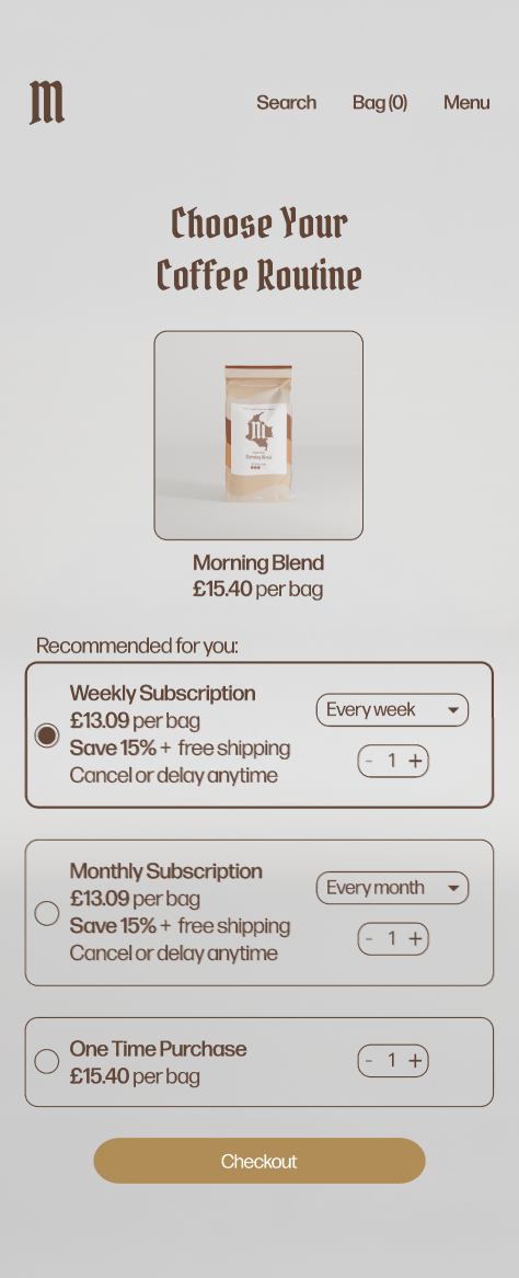
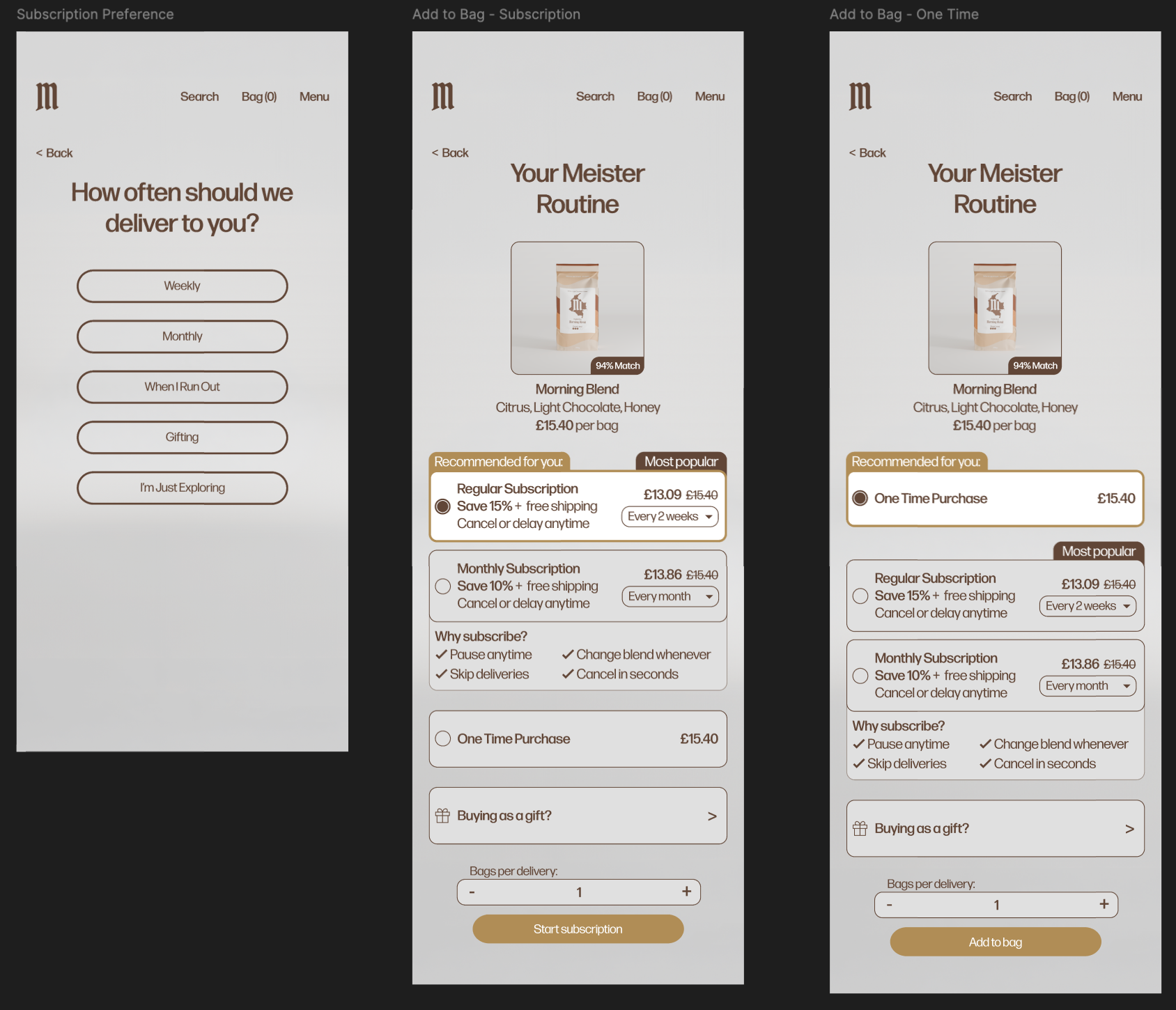
The subscription feature was integrated as part of the recommendation flow in order to create a seamless experience that felt both convenient and personalised. After the product has been selected, the user is asked how often it should be delivered.
The subscription page then suggests an appropriate frequency, from a one-time purchase to a monthly subscription. This transparent and user-friendly design helps to reduce friction in repeat purchases and increases customer retention.
The subscription page then suggests an appropriate frequency, from a one-time purchase to a monthly subscription. This transparent and user-friendly design helps to reduce friction in repeat purchases and increases customer retention.